The checkout is the last page a buyer sees before paying, and the one most stores never test. Whether it is one long page or two short steps changes who finishes, what you learn about the people who do not, and how much room there is for an extra offer. This guide explains the three layouts a Vonza store offers, Classic, One step and Two step, which products and buyers suit each, how to set the layout for the store and override it per product, and how the two-step checkout feeds abandoned-cart recovery. The product page is online store; for standalone payment pages see checkout.
The three layouts
Classic is the store's standard checkout: the full order and the buyer's details and payment handled together, the layout most buyers have seen on other stores. It is the safe default for a store with several items per order.
One step is the shortest path: details and payment on a single page, built for a buyer who has already decided. Fewer screens, fewer places to stall.
Two step splits the checkout into two screens. The first asks for name and email. The second takes the rest, including the payment. The split looks like a small thing; it changes what you can do when a buyer leaves, as the next section explains.
All three take the same payment methods: card, Apple Pay, Google Pay and Klarna through your connected Stripe account, PayPal for one-time payments, or Paystack for sales in Nigerian naira. All three show the coupon field if you turn it on, the additional fee if you set one, the gift option, and the consent tick for joining your lists.
What a two-step checkout gives you: the lead
On a one-page checkout, a buyer who leaves before paying is gone. You know a cart was started, and nothing else.
On a two-step checkout, the first step saves the buyer's name and email on the cart before any payment is attempted. If the buyer stops there, you have someone to follow up. The store's cart abandoned automation can then email them after a wait you set, such as 60 minutes, with a link back to their cart. That is the main reason to choose two steps for anything a buyer might hesitate over.
The trade is one extra click for everyone who would have finished anyway. For a $9 download that is a real cost; for a $190 coaching package it is nothing beside the recovered carts. Abandoned checkout recovery covers the timing and the wording of the follow-up.
Which layout for which product
A rough guide, to be tested against your own numbers:
| Product | Layout to try first | Why |
|---|---|---|
| Low-priced digital download, impulse buy | One step | The buyer has decided; every field is a chance to leave |
| A cart of several physical items | Classic | The summary stays in view while the buyer fills in shipping |
| Higher-priced product, a course-style workbook, a coaching package | Two step | Hesitation is normal; the lead lets you follow up |
| Anything sold from an ad to cold traffic | Two step | Cold buyers abandon more; you want the email |
| Gift cards | One step or Classic | Gift buyers want speed, and the gift fields are already on the page |
The honest answer for most stores is a store default of Classic, with One step on the cheapest products and Two step on the dearest, then watch the conversion number in Insights for a month.
Step 1: Set the store default
In your Vonza Products app, open Store settings and the Store pages tab. Choose Classic, One step or Two step as the store's checkout layout. A preview shows the layout; it is view-only, so nothing changes for buyers until you save.
Step 2: Override it per product
Open any product and set its own checkout layout. The product's setting wins when a buyer checks out with that product alone. When a cart holds products that ask for different layouts, the store default is used, which is why the default should be the one that suits a mixed cart.
Step 3: Decide what else sits on the checkout
Three settings change what a buyer sees, whichever layout you pick:
Phone. Hidden, optional or required. The default is required when the order ships, because carriers want a number, and optional otherwise. Do not ask for a phone number on a digital product unless you will use it.
After payment. Send the buyer to the order page (the default), show your own message of up to 5,000 characters, or redirect to an address on your site. A getting-started page is a good destination for a software or template product.
Lists and consent. Buyers who tick the consent box are added to the lists you choose, up to 20, with a label you write. Buyers who do not tick are not added. Keep the label plain: "Email me when new planners come out" beats "Subscribe to marketing communications".
Step 4: Add the offers that fit the layout
An order bump is a tick box under the buy buttons, in the cart and at checkout, offering another product at its price, a percentage off or an amount off, one per order. It works in all three layouts, and it works best when the bump ships in the same parcel or belongs with the same download.
A one-click offer appears on the order page after a card payment and is charged to the same card within 15 minutes, once accepted or declined and never shown again. It sits after the checkout, so it costs nothing in conversion.
Keep both to one offer each. A checkout with three bumps and a countdown is a checkout people leave.
Step 5: Watch the right numbers
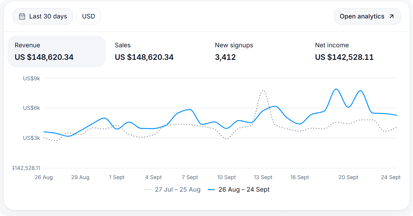
Insights shows views, paid orders, revenue after refunds, conversion (paid orders divided by unique visitors) and traffic sources for 7, 30 or 90 days. Conversion is the number to watch when you change a layout; give each change a few weeks and enough orders to mean something before you judge it.
Beside the store's numbers, your pixels tell you what ads see: Facebook, Google, Google Tag Manager and TikTok pixels fire per product with ViewContent, InitiateCheckout and Purchase events, so the gap between InitiateCheckout and Purchase in your ad platform is the checkout's drop-off for that audience.
A note on testing
Vonza does not run split tests on the store checkout, so compare layouts the simple way: change one product's layout, leave a similar product alone, and compare their conversion over the same weeks. It is less precise than a controlled test and far better than guessing.
Beyond layout: the things that lose more buyers
Layout matters less than three basics, whichever you choose.
Show the full price early. Shipping and any additional fee should be visible before the payment fields, not after.
Answer the question that stops people. Put the top one in the product's highlights or details: how long access lasts, when it ships, whether there is a refund.
Offer the payment methods your buyers use. Wallets such as Apple Pay and Google Pay remove the typing on a phone, and Klarna suits a higher price. Tick the methods per product so the right ones show.
Then let the two-step checkout and the cart-abandoned automation catch the buyers who still get interrupted.
Where to start
Open Store settings in your Vonza Products app and set a store default today, then override the cheapest and the dearest products. New to Vonza? The store is part of every Vonza plan with a 14-day free trial; the plans are on pricing. For the follow-up that a two-step checkout makes possible, read abandoned checkout recovery; for the extra offer at the checkout, order bumps.