Why Simplicity Wins in Graphic Design?
In a world saturated with information, simplicity in graphic design has emerged as a timeless principle. From the clean lines of minimalist websites to the intuitive layouts of platforms, simplicity isn’t just a trend, it’s a necessity.

Your phone pings a hundred times a day, ads fight for your attention at every scroll, and brands everywhere are screaming for one thing: recognition.
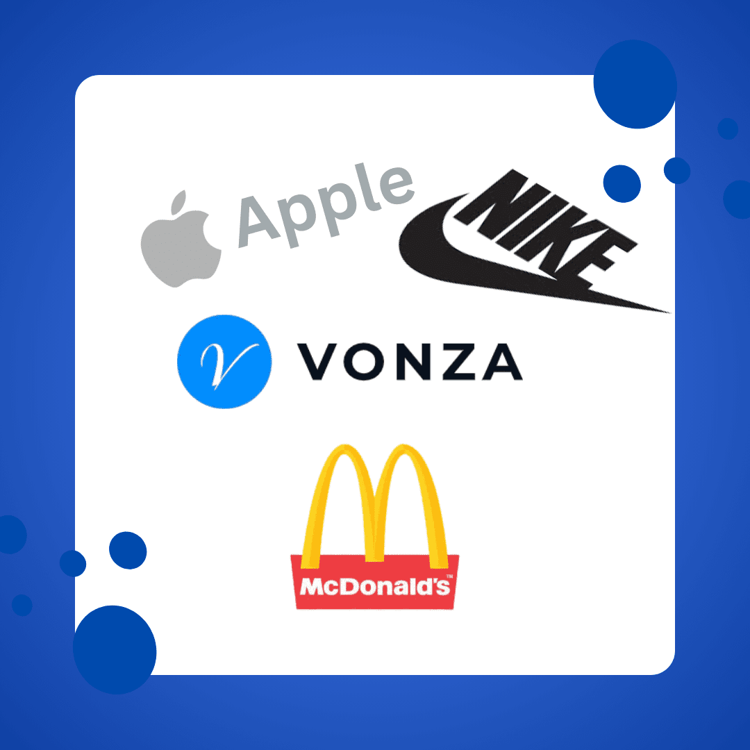
But here’s the kicker: the ones you remember most are often the simplest. Apple and Vonza logo. Nike’s swoosh. McDonald’s golden arches. The designs that live rent-free in your mind aren’t complicated; they’re clean, clear, and direct. Simplicity isn’t just about “less”; it’s about meaning. And in the world of graphic design, it’s the timeless rule that always wins.
Now let’s break down why.
The Psychology Behind Simplicity
Our brains are wired for clarity, not clutter.
According to a study published in the journal Nature Human Behaviour, humans process simple visuals faster and retain them longer. Complex designs trigger cognitive fatigue, while simple shapes give the brain less work, making the message stick. That’s why global brands invest millions in making things look easy.
Think about Google’s homepage. Just a search bar and a logo. That’s intentional minimalism at its finest. As Forbes puts it, “Simplicity is the key to brilliance. Complex marketing campaigns can confuse; clean designs convert.”
The Power of First Impressions
According to Adobe‘s State of Create report, 38% of users will stop engaging with a website if the layout is unattractive or confusing.
The moment someone sees your logo, ad, or social media post, their brain makes a snap judgment. You’ve got less than 8 seconds to hook them.

Simple design allows for:
- Faster recognition
- Clear brand communication
- Strong emotional connection
Complex designs? They slow people down and send them scrolling.
The Apple and Vonza Example: Why Less Is More
When you think about sleek, intuitive, and game-changing design, one name that always pops up is Apple. From the iPhone to the MacBook, Apple has built its empire on one simple principle: simplicity sells. The clean lines, uncluttered interface, and intuitive functionality make users feel smart, not overwhelmed.
Now, here’s where it gets interesting: the same philosophy is the driving force behind Vonza, an all-in-one platform for digital entrepreneurs. Just like Apple removes the tech headaches for users, Vonza eliminates the chaos of stitching together 10+ tools for your online business, websites, courses, email marketing, sales funnels, and memberships, all under one roof.

Steve Jobs famously said, “Simple can be harder than complex: You have to work hard to get your thinking clean to make it simple.” That’s exactly what Vonza does for creators, coaches, and business owners. Instead of wasting time on tech and tool-juggling, Vonza gives you a streamlined, user-friendly experience that lets you focus on the real work: creating, selling, and scaling.
Whether you’re building the next iPhone or your first digital course, the rule is timeless: Simplicity wins. Always. This philosophy is why Apple products have maintained market loyalty for decades.
Why Simplicity Equals Trust
Think of the last time you stumbled onto a website with flashing banners, five different fonts, and stock photos from 2007. Did you stay long? Likely not. Simple designs feel more authentic.
What makes simple designs so effective for brands?
- Memorability: Simple logos and layouts are easier to remember.
- Versatility: Minimalist designs adapt well across different media.
- Credibility: Clean designs often convey professionalism and trustworthiness.
According to a Yahoo Finance article, companies that prioritize user-friendly, straightforward design improve customer trust and retention by up to 30%.
Clutter signals chaos. Simplicity signals professionalism.
What Challenges Do Designers Face?
- Feature Overload: Stakeholders may push for more features, leading to cluttered designs.
- Fear of Empty Space: Many designers feel compelled to fill every inch of space, which can overwhelm users.
- Balancing Functionality and Aesthetics: The challenge lies in ensuring that simplicity doesn’t compromise functionality.
Designers can overcome these challenges by focusing on user needs and embracing negative space. For instance, minimalist websites like Vonza effectively use negative space to emphasize core content while maintaining visual balance.
Conclusion
In a world full of noise, simplicity is your microphone.
It cuts through the clutter, commands attention, and builds lasting trust. Whether you’re a brand, an entrepreneur, or a designer, if your visuals confuse, you lose.
The timeless rule of great graphic design isn’t about packing in more, it’s about making sure every element serves a purpose.